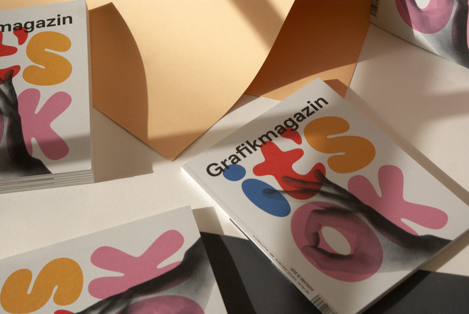
"Intellectual underchallenge is an insult", Fons Hickmann told us in an interview, and yes, design can and must challenge us and make us think. In this issue of Grafik+, we look at the topic of "poster design" and a medium that challenges us intellectually like almost no other. Whether it acts as a cultural mediator or a political activist, a poster touches us like hardly any other means of communication. Look forward to the Grafikmagazin 05.21 with a focus on poster design ...
A second focus in this issue is the topic of "sustainability". We want to approach it from a slightly different angle and present projects and approaches that may not be so obvious, but are no less interesting and effective for that. Of course, there is also plenty of creative input, for example, we present the results of the European Design Awards and showcase great new work from Switzerland, books and magazines that are well worth seeing as well as the finest in type design.
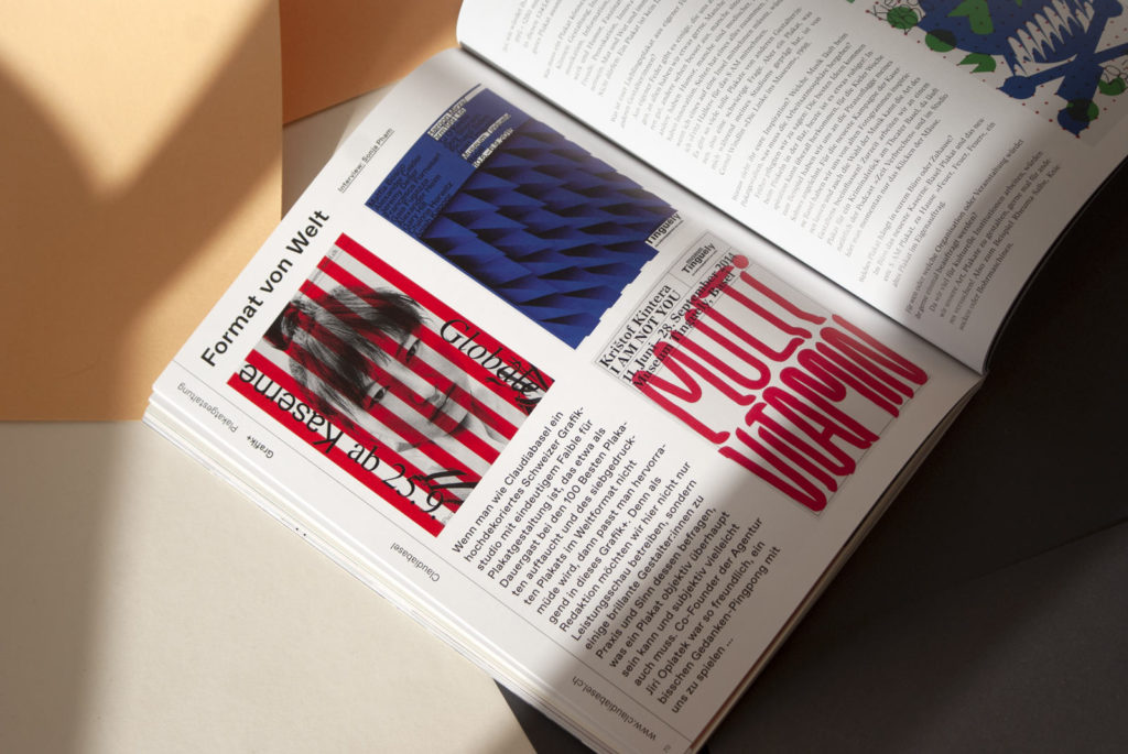
Graphics+ Poster design
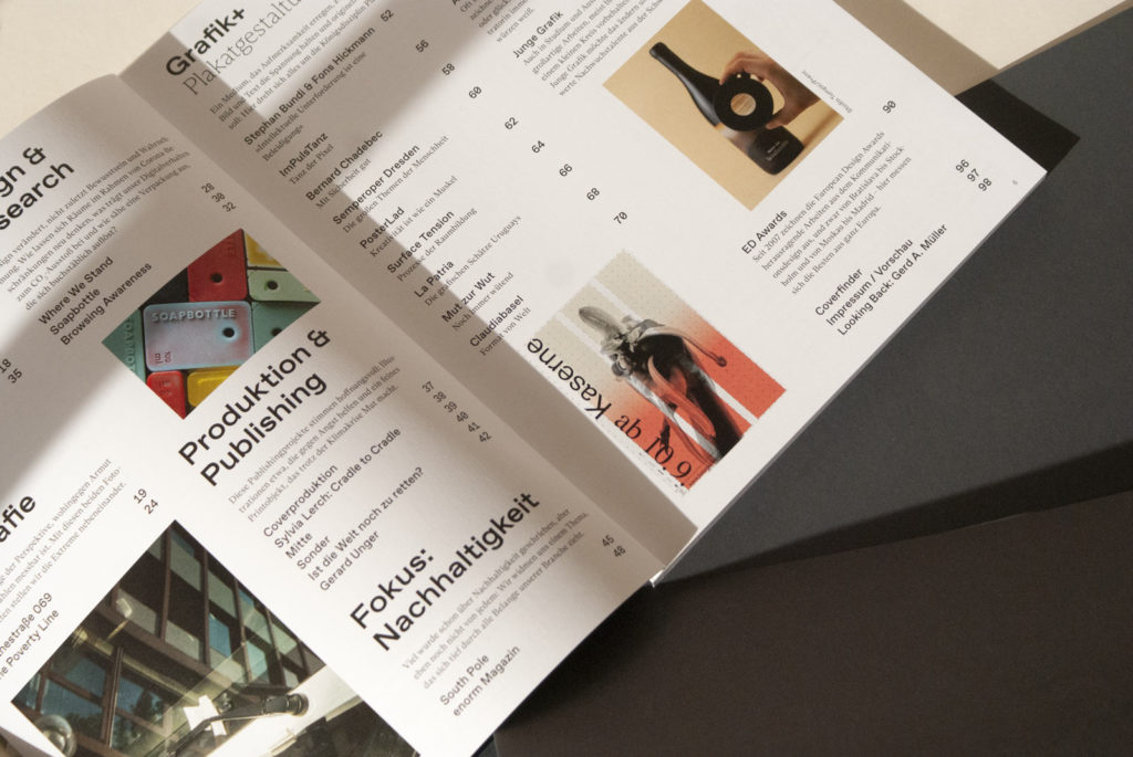
What makes a good poster? What is worthy of an award and what tips can be given to young creatives? In this issue, we take a twenty-page look at the poster, show it in its role as a cultural mediator and political activist and present outstanding works from many decades. Stephan Bundi and Fons Hickmann engage in a lively discussion about poster design and the role of competitions. The ImPulsTanz project shows how posters can make good use of digital possibilities and in her bachelor thesis, Molly Rose Dyson explored which elements or design parameters specifically make a poster interesting. We also take a look at Uruguay, a country with a rich graphic history that is little known. And last but not least, the cover of this issue also features a poster motif.
The content
Exhibitions and events are finally taking place again, so in this issue we also report on the new Typo St. Gallen and an exhibition worth seeing in the Munich City Museum that sheds light on the city's club culture. However, the enforced silence during the lockdowns also had some positive effects, for example Rosmarie Tissi designed five Corona alphabets - we present them. In our photography section, Malaysian photographer Stefen Chow and economist Huiyi Lin from Singapore explore the question of when you actually become poor with their project "The Poverty Line" and Anton Rahlwes documents the other extreme, Goethestraße in Frankfurt. Somewhat lighter fare is promised by great branding projects and our leaf blower, which this time deals with the topic of "free projects".
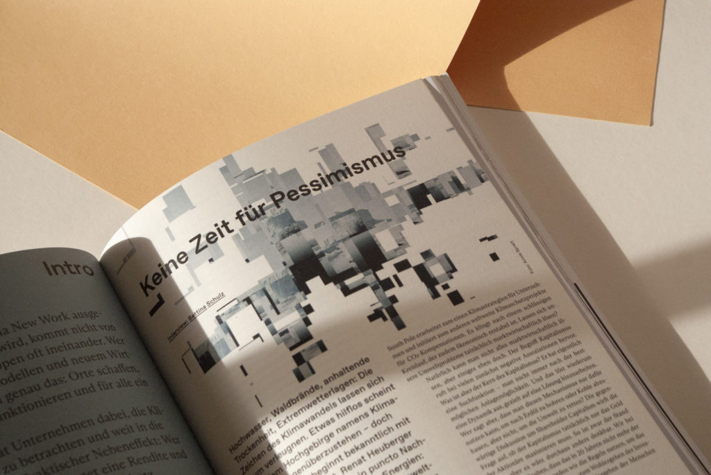
With the 05.21 Grafikmagazin , we are also starting a focus section on the topic of "sustainability". Environmental scientist Renat Heuberger, for example, advises companies and helps them to become more environmentally friendly and offset emissions. Capitalism has a search function, he says, and why shouldn't it be used to generate more environmental protection instead of more returns? When enorm magazine was founded in 2009, it was still about sustainability. Today, it deals with society, lifestyle, the environment and the economy and shows how many parameters can lead to a good life.
It's showtime
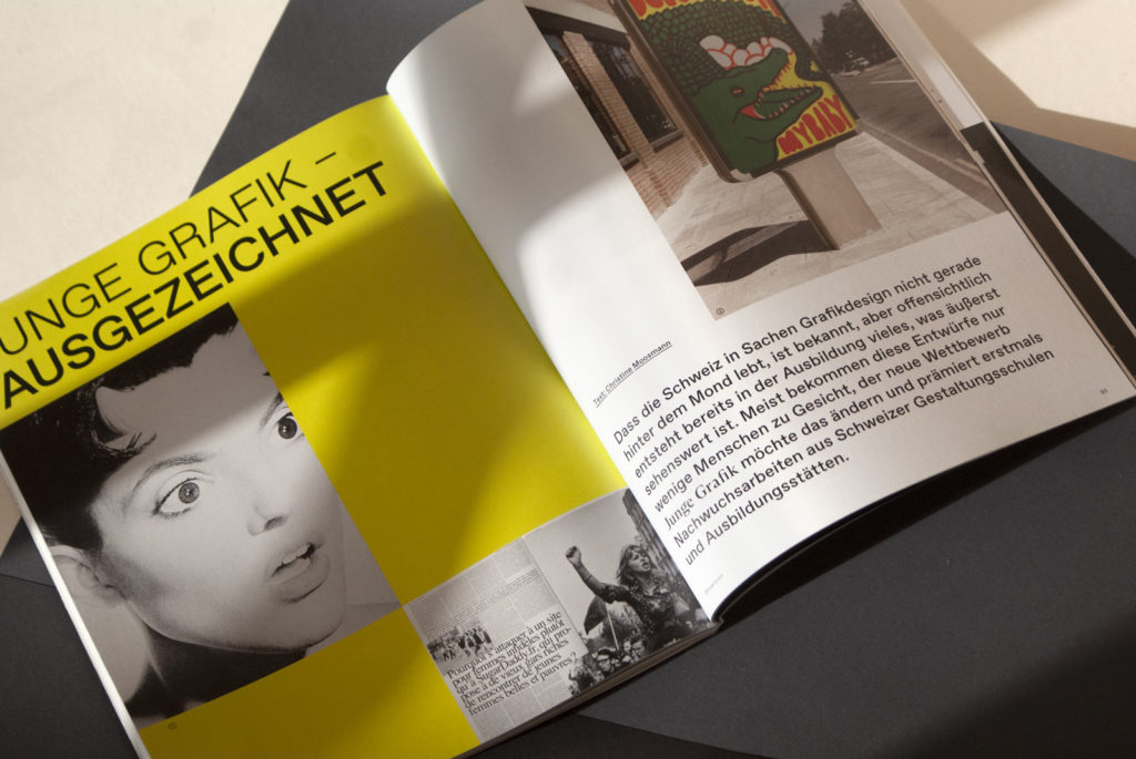
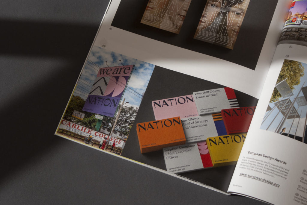
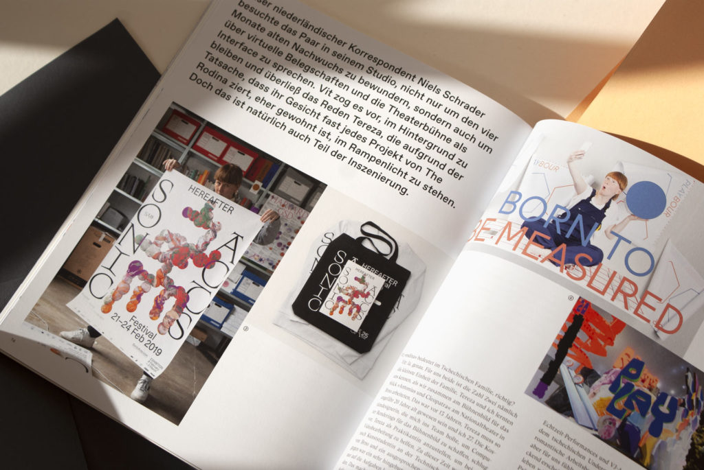
This issue of our showrooms is all about theater, everyday madness and the big stage. Amsterdam-based design studio The Rodina combines videos, interactive media and installations with visuals and graphic design and shows how the audience can become an actor. Alexandra Turban had to juggle childcare during lockdown and her job as an illustrator. The night shifts certainly didn't harm her creativity, but perhaps explain the dark circles under the eyes of many of her characters. In Switzerland, the "Young Graphics" competition was launched for the first time this year, honoring the best young works by students and trainees. We show a selection of the award-winning works. And we were also spoiled for choice at the European Design Awards, because as always, the standard here was also impressive. See what Europe's best creatives have to offer, from posters to signage systems, from packaging to book titles.
The cover
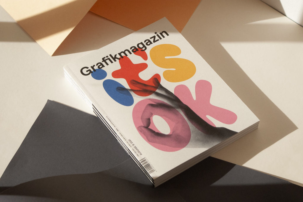
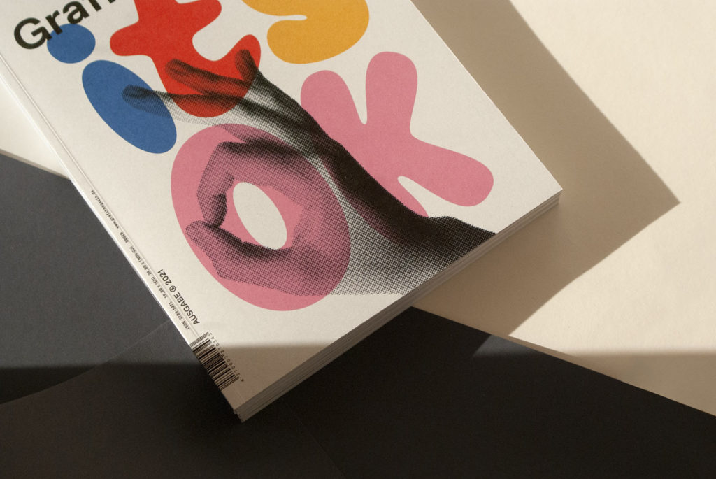
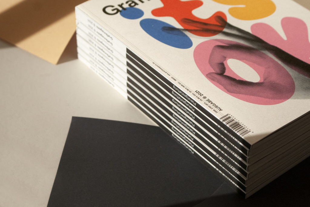
Sometimes all you need for a good cover is a great motif and attractive paper. For this issue, we chose a design from PosterLad that not only looks friendly, but also conveys a message that does us good from time to time in these times: It's OK!
The cover was printed offset on Munken Polar in 300 gsm. The uncoated paper is not only pleasant to the touch, the manufacturer Arctic Paper has also aligned the entire production process to the Cradle to Cradle standard. An attractive and environmentally friendly choice.
In this issue, our focus is on "poster design", where you can find out more about "typography", "corporate communication" and appetizing projects from the world of gastronomy and food.

